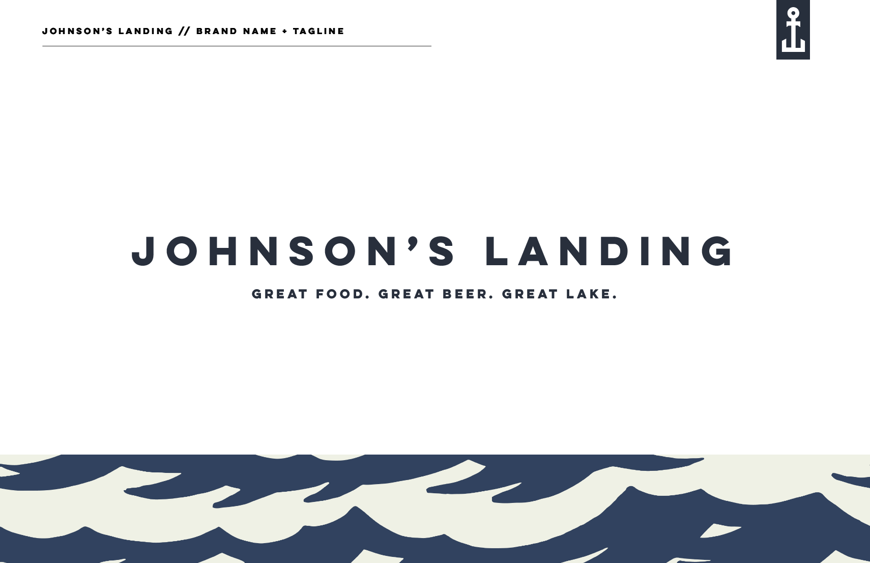
Johnson’s Landing
Great Food. Great Beer. Great Lake.
Johnson’s Landing is poised to become the go-to restaurant and brewery near Lake Erie, on the outskirts of Buffalo, NY. Focused on delivering exceptional food, beer and service, the brand embodies a commitment to quality and a welcoming atmosphere for family, friends and the community as a whole. The vision for Johnson’s Landing established it as a destination by the lake, blending sophistication with comfort to create a space where both locals and visitors feel at home.
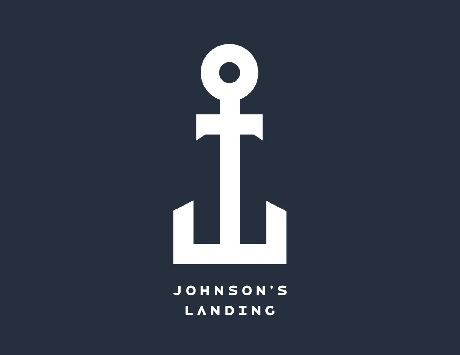
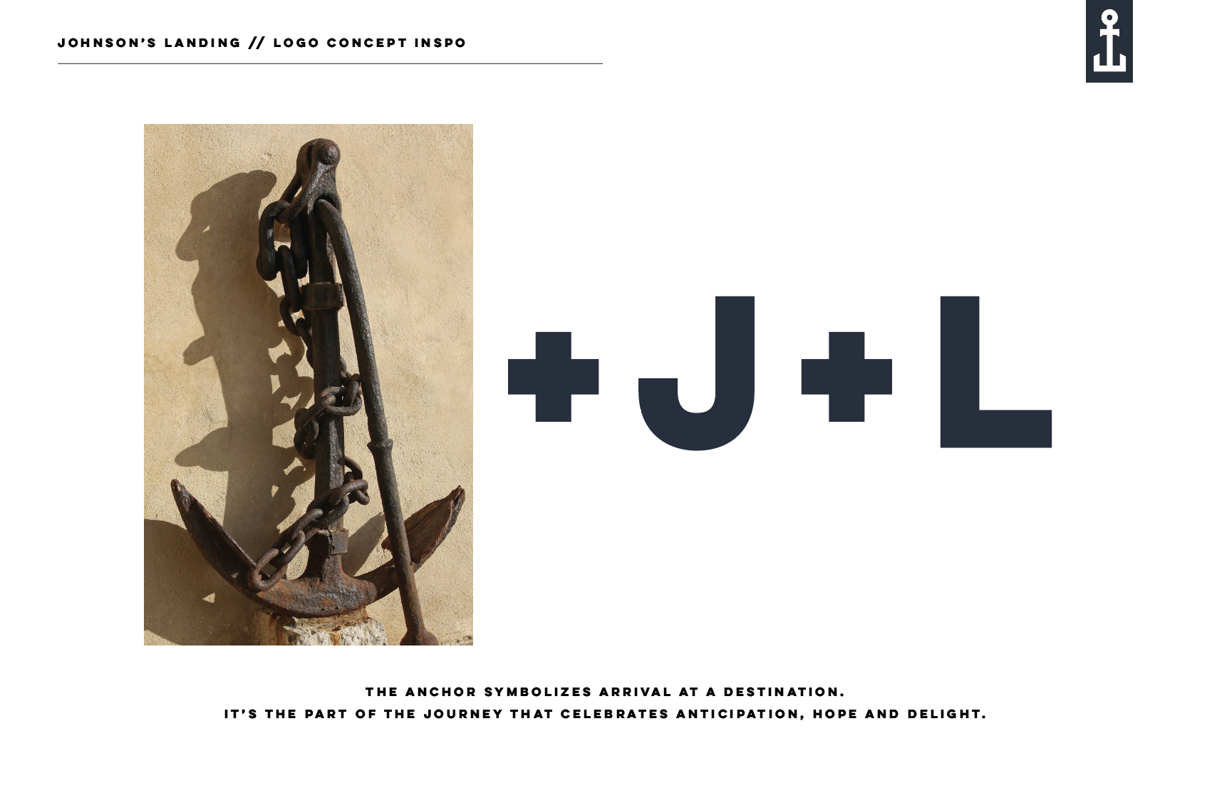
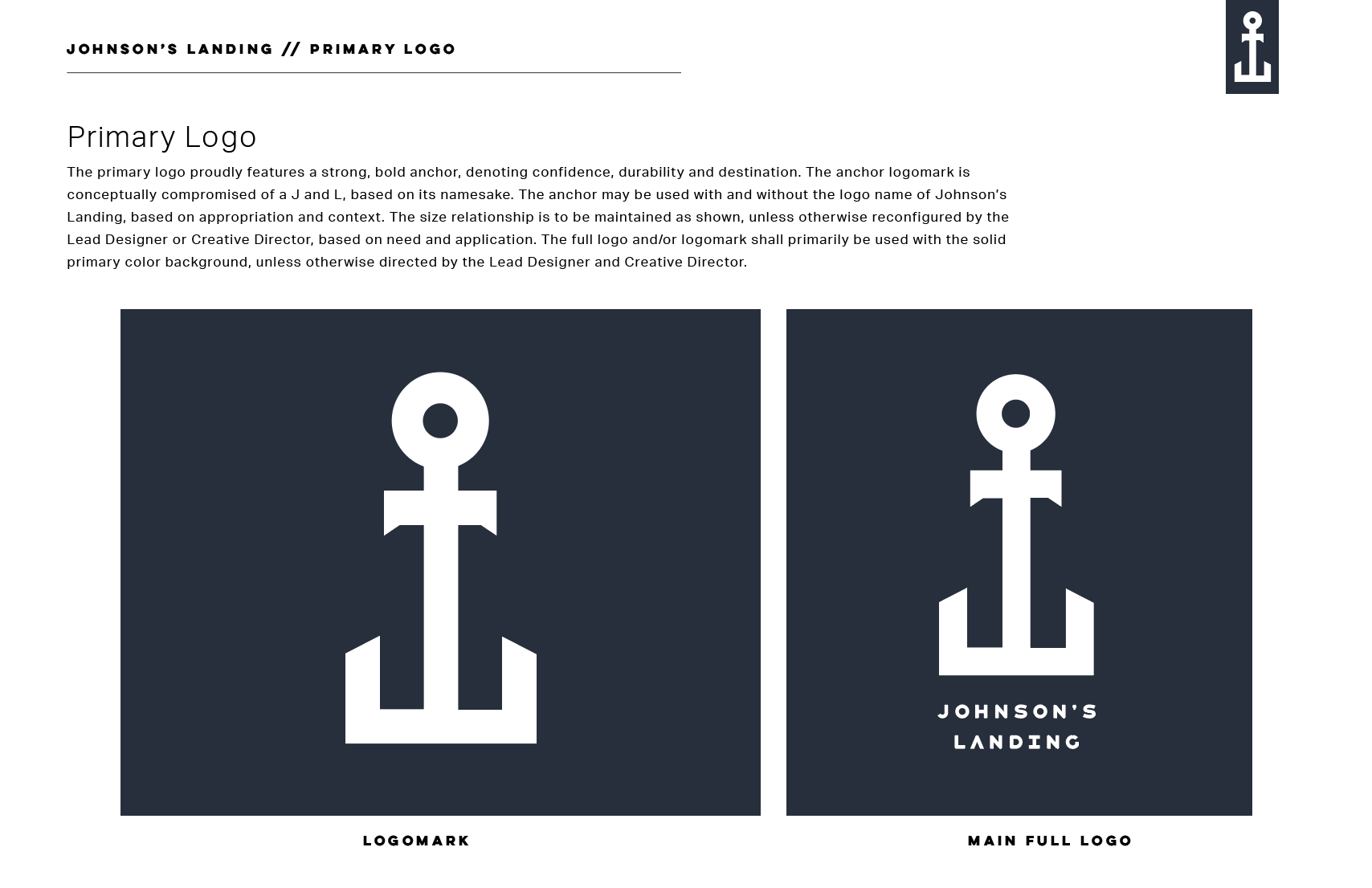
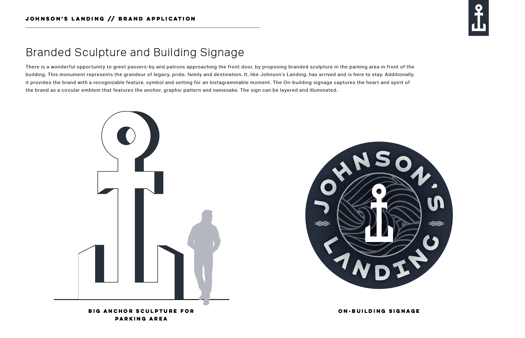
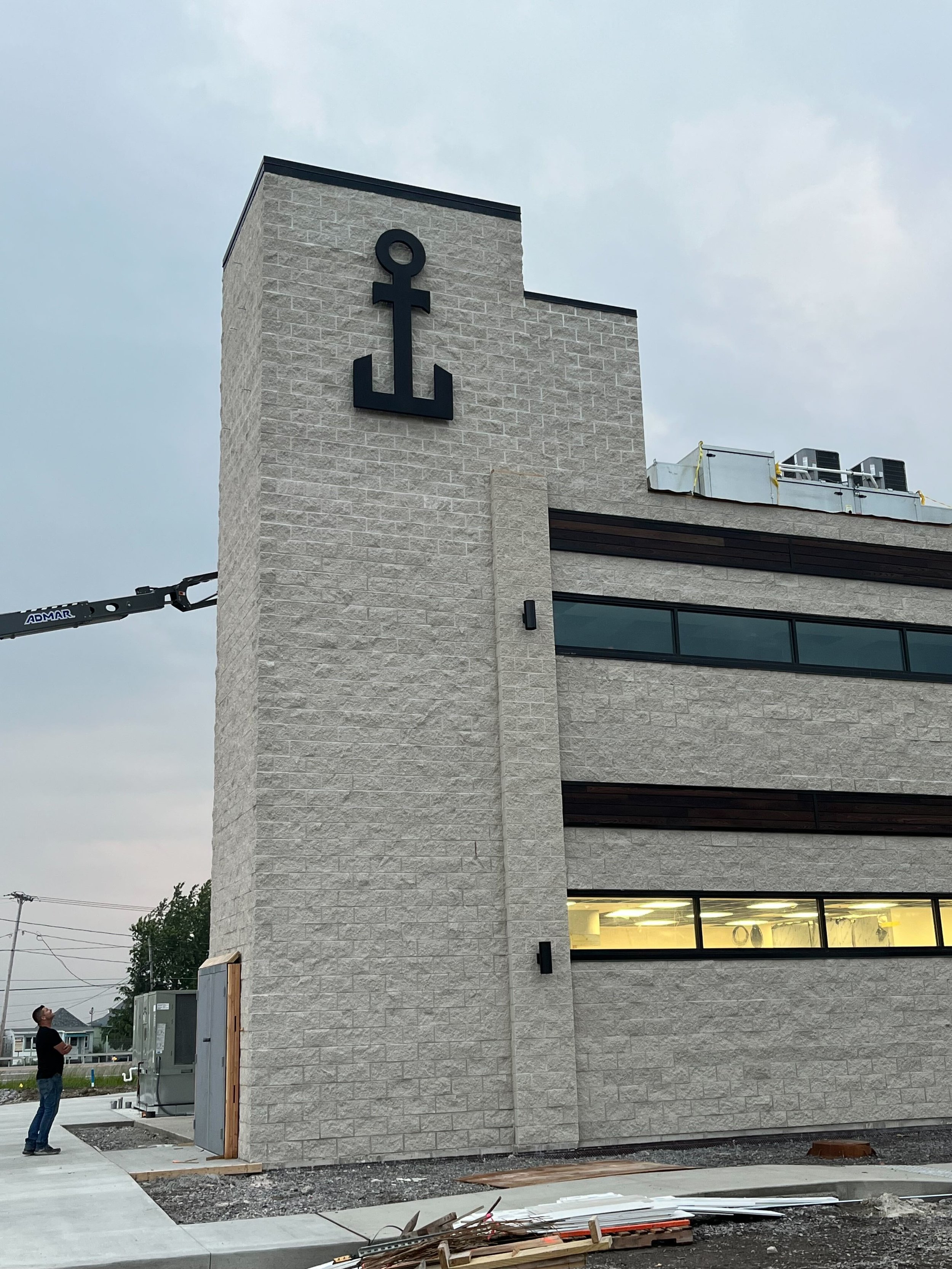
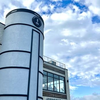
The brand’s identity was crafted to reflect a place where you’d want to drop anchor and enjoy quality time. The logo concept was born of juxtaposing the letters J and L of ‘Johnson’s Landing’ back to back to form a logomark of an anchor. This iconic maritime symbol represented more than its geographic location. It stood for the concept of reaching your destination. The anchor symbol was further celebrated as a 12-foot high metal sculpture, proudly displayed on-site. Initially intended as a monument sign by the main road, city restrictions prevented this. In a clever response, the large anchor was placed closer to the building, creating a popular Instagrammable moment.
This is one of those crazy times when the concept and vision came together in a flash of inspiration in the middle of the night, resulting in a unique and inviting experience that captures the essence of what makes Johnson’s Landing a special spot for gathering and relaxation.


Role: Brand Vision + Story, Concept, Tagline, Brand Naming, Brand Design, Design + Direction of Public Art
Client: Bob Johnson / Johnson’s Landing
Agency: Arthur Elliott